b #13
Abril.05
|
1. The Collaboration
Asger Jorn was one of the founding members of the Situationist International (SI), after he had enthusiastically received copies of Potlatch from a friend, a magazine which pre–dated the founding of the SI. The magazine sparked Jorn’s fascination with Guy Debord and the two met in Paris in 1954. Almost immediately they set out to plan several collaborative projects. The making of the two books happened in what Guy Atkins describes as «the first, formative, tentative, and relatively tolerant phase» of the SI[1].
Jorn’s involvement in the movement was short lived, as he decided to leave the SI in the early 60s due to the fact that he was starting to sell his paintings and make a profit, something which did not fit with the direction in which the SI was moving. He was one of the very few people who along the way became involved with the SI, and who on his own terms decided to leave. It was practically a custom within the SI to expel members left and right, when Guy Debord saw them to be illfit for the movement. Even though Jorn had left the SI he still remained good friends with Debord, and over the years he contributed a large amount of money to the printing of the Situationist magazine, International Situationniste[2] . Guy Atkins describes his departure in the following way:
He resigned in April 1961 owing to various personal circum-stances, but probably in part because he felt that the formative period, during which he could exert some influence, was coming to an end.
Before I go into a analysis of the two books, I think it is necessary to draw out some details about the relationship between Guy Debord and Asger Jorn. It is described very differently, depending on the source. Guy Atkins who wrote a three volume biography on Jorn draws up quite a hostile picture:
As a prototype Marxist intellectual Debord needed an ally who could catch up the difficult human relationships and who could rise above the petty egoisms and squabbles of the members. Their quarrels came into the open the moment Jorn’s leadership was withdrawn in 1961.[3]
It seems very clear that Atkins is trying to diminish the role that Jorn’s involvement in the movement had for him, even though it clearly founded his interest in the usage of using paint as a device to connect parts of the image surface with other parts, and interconnecting text with each other[4]. This method which he developed for Fin de Copenhague was later used in his paintings. It is, however, never hinted anywhere in Situationist writing or writing about the Situationists that they ever had more than one leader — which was Guy Debord. No one else was ever in charge of the SI. Jorn describes Debord in the afterword to the facsimile edition of Fin de Copenhague as:
«I contracted a debt towards the movement Situationist and, by name, towards this single character, deeply worrying, and encouraging who is Guy Debord».
In the preface to Debord’s 1964 book, Contre le Cinéma, Jorn writes:
I have met no one else but Guy Debord who, unaware of the other problems which could attract his attention, concentrates himself exclusively, with a maniacal passion and a capacity which comes from that, on the task of correcting the rules of the human game according to the new given conditions of our time.
Even though Jorn’s involvement was brief, it took place during a very intense period. He managed to create some of the most infamous SI projects, partly alone and partly in collaboration with other members. Most notably was the work he did together with Guy-Ernest Debord. At this point, late 50s to early 60s, the SI was busy creating maps of cities, critiquing modern urban development. Ideas of new urban and inner city development materialized in this period from a wide range of SI members.
One of the many people that Jorn introduced to the SI, was the Dutch architect Constant. While he was a member, he developed the plan for a architecturally designed refugee camp. Other members played on the idea of purposeful disorientation. One idea that surfaced was that one would walk through a city guided by the map of another city, thus getting lost. It was only when you had completely lost control of the city’s normal guidance system (a system that is only there to constrain you) that you would be able to rediscover the city on your own terms, and not those dictated by the city.
The notion of psychogeography and détournement were terms that were formulated during the existence of the Letterist International (LI), Debord’s group prior to the SI. The notions worked as the overall skeleton on which they could build and expand their ideas of a critique of the city. One of the earlier methods of psychogeography was dérive — or drift. The idea was based on a character walking through the city and rediscovering it on his own terms, without ever having a goal. Drifting through the street, seemingly without a purpose. Paris was the city of choice for the LI, it was here their ideas were coined, it was here the thinking, drinking and experimentation took place and it will ultimately here that the war would be fought.
One of the first results to come out of the collaboration between Debord and Jorn was a screen printed map of Paris. They had taken a three dimensional overview map and cut it into pieces, each piece represent ting a part of the city that they thought was «worthy of study and preservation»[5]. The map was entitled Guide psychogéographie de Paris: discours sur les passions de l’armour. Each piece of the city was placed in its correct position within the city and black arrows were drawn to indicate how you could get from one part of the city to another by Taxi, thus ignoring the rest.
Only Taxis allow a true freedom of movement. By traveling various distances in a set time, they contribute to automatic disorientation. Since Taxis are interchangeable, no connection is made with the ‘traveler’ and they can be left anywhere and taken at random. A trip with no destination, diverted arbitrarily en route, is possibly with a Taxi’s essential random itinerary[6].
This map and a later one, The Naked City from 1957, were illustrating the notion of psychogeography. Each preserved part of the city had some sort of sentimental value attached to them. The maps also worked as a guide to the forgotten or overlooked parts of Paris, that were yet awaiting to be hit by the forces of capitalism.
The making of . . .
The making of Fin de Copenhague and Mémoires is explained in detail in a book compiled by Troels Andersen, the curator of Silkeborg Kunstmuseum. It is entitled, Erindringer om Asger Jorn (Memories on Asger Jorn), and entirely in Danish. It contains various stories from people who worked and — or knew Jorn well. In one specific story, V.O. Permild, a printer, explains how he met Asger Jorn and how their cooperation evolved over the years. Permild owned and ran a print house downtown Copenhagen that specialised in printing artists works, such as books and large-scale lithographs.
They had met more or less coincidental through a friend. Jorn had been looking for a printer who could print up his works. Permild’s business had gained an excellent reputation in artists circles. Jorn, who had a professional background as a book binder, was very keen of being part of the whole process. Since he knew how it worked, he was able to control the technically sophisticated process — and use it for whatever purpose he saw fit. Permild explains how Jorn worked:
Asger normally worked very swiftly. From the moment he positioned himself by his worktable, he worked, and until the result was lying in a finished printed version, only a short time went by. Silently singing he worked spontaneously, but conscious on the printing plates and did not stop, before he would be standing with the finished result in his hand. Though, at occasions there could go a while before the graphic found a need.
It is important to understand that both books were the result of a collaboration not just between Jorn and Debord, but also with the printer, Permild & Rosengreen. It is common to neglect the importance of the printer’s role. It is impossible for anyone to know everything about the process of making a book. At some point in the development it is necessary to give some aspects of the making into the hands of people who deal with this sort of thing; in this case the printing. It is not a negative thing to emphasise his or her importance, which was something that Jorn was aware of.
The Artist can only very rarely do without the help of a printer, for it is precisely through the co-operation of artist and printer that firstrate results have been achieved[7].
To acknowledge the work done by Permild & Rosengreen, Jorn drew up a logo of their business and added it to his book, Fin de Copenhague. It also appears at the end page of Mémoires.
2. The Books
Fin de Copenhague
Permild goes on to explain how Jorn and Debord one day came into the print house, with a request to be driven into town. They had just arrived from Paris, and «something had to happen» , as he put it. They were dropped of outside a kiosk, went in and bought a huge variety of national and international newspapers and magazines. The next morning they arrived with 32 pages of newspaper collages. Pictures and text had been combined overnight, to what should turn out to be Jorn’s goodbye to Copenhagen. According to Debord the making of Fin de Copenhague had happened in a «bad tempered and drunken afternoon after a raid which he and Jorn had made to a Copenhagen newsstand. They had stolen newspapers and magazines. . . »[8] .
This is a good example of what the Situationist meant by the when they referred to the spectacle. It also introduces us to another SI concept, namely détournement. They saw the spectacle as the all embracing alienating culture in which they lived. A culture that took all real experiences away from its inhabitants and replaced them by used one’s that had been played over and over again. In this case the newsstand is an obvious example of propaganda for the spectacle, presenting that alienating world view. They had set out to «auto-destruct» the spectacle by means of détournement. A word which was already present in the French dictionary, but one that the Situationists adopted. It emphasized the idea of re-using already established elements. It translates as:
Détournement: diversion, rerouting, hijacking, embezzlement or misappropriation (of funds), corruption of a minor.
The collages were re-photographed and transferred unto print plates. Then Jorn got hold of a ladder and positioned himself above the plates, where he dropped cup after cup of different coloured Indian ink unto the fragile zinc plate. In the end, the plates were etched and were ready for printing. The cover was made up of cardboard substance from discarded newspaper and embossed under extreme heat and pressure.
This was a radical attack on the sacred institution of print making. Jorn had set out to intentional handle the fragile zinc plate as he felt like by dropping ink on them from great heights. A method that is not normally practiced, representing not only a disrespect for the nature of print making but also a indication that print making should not be looked upon as a black art. «The whole cavalier attitude to the sacred rituals of printing may be taken as a fair example of the frame of mind that prompts Jorn to refer to himself and colleagues as the Bauhaus Imaginiste or even Bauhaus Imaginaire»[9].
The whole thing was printed and bound, two hundred copies signed and numbered by Jorn and Debord. Less than 24 hours had passed, from idea to production, to the finished product. This was a spontaneous project – and with a very limited edition printed, echoes the values embedded in Old World «artist books». Most copies of this publication are probably lost by now. Quite a few are, thankfully, part of historical book collections at most major Danish libraries. Needless to say, this Situationist book has risen to a stupendously high price, if you are able to find one on the market[10].
Not only is the book itself a visual example of détournement, the making of it, conforms to the notion as well. The very idea of assembling a book, something which usually takes months and months of planning and careful crafting, and printing it within such a short time frame, casts some light on the madness of early Situationist works.
The SI was battling a war against the fact that everything in their lives had already been turned into a commodity ready for consumption. No part of it had been left untouched by the spectacle. Nothing remained sacred or immune to its powers. It saw itself attached to a class system, strongly depending on a structured society where everybody knew their place. When one spectacle ended, there was always another ready to take its position.
The spectacle epitomises the prevailing model of social life. It is the omnipresent celebration of a choice already made in the sphere of production, and the consummate result of that choice. In form as in content the spectacle serves as total justification for the conditions and aims of the existing system[11].
Jorn and Debord took that «choice which had already been made» , and reused it, creating new meaning. A new visual representation of a representation. As earlier mentioned, the making of these books took place during their artistic phase, where they still thought that art could make a difference. This changed radically in the early 60s. The SI decided, with Debord at the steering wheel, that it was about time to change direction. At this point they were more interested in theorising their ideas, than producing works around them. Those who tried otherwise, were expelled, « . . . a member proposed that any work produced by a Situationist from now on be labeled anti-Situationist»[12].
Looking at the cover of the original, gives you an impression of how much craft went into making it. Consisting of a densely embossed razor blade advertisement; very hard to read or even to make sense of. Running your hand over it reminds you of a medieval manuscript with thick embossed text. The cover completely lacks colour, which does not corresponds to the visual experience of the actual content of the book, which is spacious and colourful.
Fin de Copenhague is physically not very big, almost like a little A5 folder. Printed on matt yellowish paper and sewn together. It has a very fluid design, with the paint floating on the page, intermixing with the text cutouts, comics and photographs — all extracted from a wide range of national and international newspaper and magazines. Taken out of one context and replaced within another one. The collage parts and colours were technically produced as two individual layers. First a zinc plate with the newspaper clipping would run through the lithographical printing machine, then a plate with the colours would through, using the same piece of paper. Ultimately merging the two on the page. Asger Jorn is credited as the author with Guy Debord «conseiller technique pour le détournement» (Adviser in the techniques of détournement). The book was published under EDITE PAR LE BAUHAUS IMAGINISTE, Jorn’s pre-situationist group. This group was merged into what should become the SI in the summer of 1957, a few months after the making of Fin de Copenhague.
While the original Bauhaus had sought to apply art to functional purposes, Jorn’s Imaginiste Bauhaus took the opposite stand and advocated the use of technology for aesthetic, that is, nonfunctional, ends[13].
The book is Asger Jorn’s goodbye to Denmark – an insult in itself, since he had always had a close relationship to his home country. It draws up a seemingly random picture of Jorn’s life, and shows us disconnected maps of the places he devoured. Moreover, the book has no structure. It has no inherit narrative that guides you from page to page. It can be enjoyed from front to back or the other way around. The book itself seems to show the many places where Jorn spend his youth; where he got drunk. It «May be read in any direction, and [which] the reciprocal relationships between phrases are invariable incomplete»[14]. This goes hand in hand with the intentions of the Psychogeographical map that the book is.
A science of situations is to be created, which will borrow elements from psychology, statistics, urbanism and ethics. These elements have to run together to an absolute new conclusion: the conscious creation of situations[15].
Psychogeography is this science, or at least a pseudoscience since it cannot be compared to a science in the traditional sense of the word. For the Situationists psychogeography was a method of finding the lost city within the already established boundaries of the city. By ignoring all the parts of the city that emphasised the powers of the spectacle, they could somehow rediscover its lost values. Debord would later ‘codify’ the many Situationists terms, and he wrote of détournement as the «. . . study of the precise effects of the geographical milieu, whether consciously arranged or not, and its direct influences on the effective behaviour of individuals»[16]. In this case, the individual is Asger Jorn. The book is not a self-portrait, but a satire on Copenhagen and Denmark, with its inclusion of specific danish products spread across a few pages. It reads, for instance, in the beginning of the book: «Copenhague — I spend my time . . . the feeling to be crushed of tiredness». There are no direct references to Jorn’s life, perhaps with the exception of specific locations and alcohol. The amount of liquor bottles contained in Fin de Copenhague is massive and together with the colours thrown on the pages, it sometimes resembles the very liquid contained in them.
I don’t remember ever seeing a book containing so many liquor bottles, and sometimes it feels as if the liquid colour is streaming out of the bottles. It is a psychogeographic drawing over the places, with intoxication and drunkenness, that Jorn seeked in his Scandinavian youth[17].
The book is full of small maps and other territorial markings. On a double page spread a map is presented to us, supposedly resembling Denmark. Its form has no similarities to that of Denmark, but a few city names have been scattered across with a vivid mono-colour floating in between and across them. In the upper right corner it reads: «Un splendid paysage que Bernard Buffet a souvent peint» (Splendid landscape that Bernard Buffet has often painted). All across the double page spread a vivid green colour has been thrown, floating unto the page from the left hand side. Four areas are marked in a black grid system varying in size, indicating different cities. It then reads the four city names next to the grid area: «Silkeborg, København, Aarhus and Kalyehave», all places with close connection to Jorn’s upbringing. Bernard Buffet was famous for painting his first painting at the age of 12 of his deceased mother. Jorn is obviously ridiculing the French painter by including the above sentence on a page that does not resemble his painting style at all. The style cannot be compared with the green paint tossed across it. His paintings were of a figurative nature, as opposed to abstract, often containing characters with rather triangular faces. One of Buffet’s trademarks were his remarkably big signature that would often decorate the center of the canvas[18].
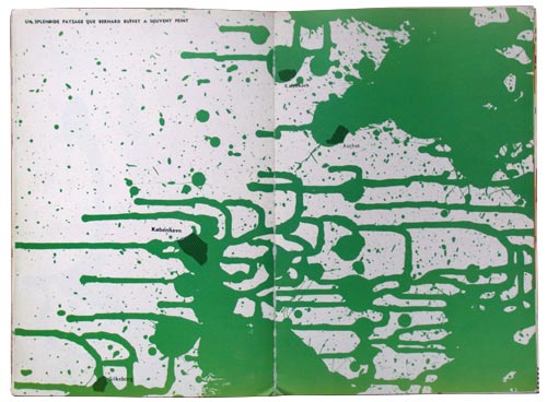
Fin de Copenhague double spread, featuring Bernard Buffet.
It was this kind of artistic individuality and style that the Situationist set out to bring down, or at least make fun of. Whereas Buffet’s paintings were carefully crafted, the page in Fin de Copenhague is of a diametrically opposite nature, with the paint carelessly tossed across it. The page becomes a statement, not personally against Buffet but against the carefully crafted nature of art. Buffet was probably selected because he was an easy target with his strictly personal style and his obscure background history. It is somehow telling us that art does not need to be crafted, rather, the less energy that goes into making a piece of art the stronger it probably is, perhaps indicating a lack of spontaneity, something which was certainly present in Jorn’s book. Comparing this double spread with the rest of the book resplendently shows that no single page looks the same – but it does give the impression of a certain artistic style, even though the elements placed within the pages have been assembled from different sources. The style lies in the way Jorn used colour throughout the book. No block of colour has the same form or intensity, nevertheless, the book inherits a certain look. It is with this page spread as with the rest of the book; some of the juxtapositions make sense others simply confuse you more than anything else. For instance, if you would not know who Bernard Buffet was, the whole message would have been lost. Jorn and Debord is, with other words, depending on the fact that the book will be viewed by art informed people, or at least people with prior knowledge about key Situationist concepts. You need to know about these in order to unlock the pages. However, as Architectural Review wrote in their October 1957 issue: «The result has the elegance, and the lack of meaning, of a zoning diagram, and the paper-planners pretensions cut down to the size by the accurately backhanded caption Bernard Buffet [. . . ]»[19]. This is a good example of visual détournement in action. Using the pre-conceptions embedded in a painter such as Bernard Buffet, and then presenting an abstract green splash of paint across two pages with various city names spread between them. Building a map that relates to places where Jorn has been, and ridiculing a famous French painter. A simple, effective yet elegant way of using the means of détourement for the re-appropriation of existing matter. This is just one of the many visual examples of détournement in the book. On another striking double page spread it reads in English:
What do you want? Better and cheaper food? Lots of new clothes? A dream home with all the latest comforts and labour saving devices? A new car . . . a motor launch . . . a light aircraft of your own? Whatever you want, it’s coming your way -plus greater leisure for enjoying it all. With electronics, automation and nu-clear energy, we are entering on the new Industrial Revolution which will supply our every need, easily . . . quickly . . . cheaply . . . abundantly.

Fin de Copenhague double spread.
Directly asking its readers whether or not any of promises given by the spectacle have been fulfilled, or perhaps asking if those are the things we really want? Could it be an «aim of bringing to the surface the unfulfilled utopian promises that haunt mass-media communication»[20].
On one of the more direct double spreads it reads from bottom down: «Dix minutes aprés, l’émotion étant dissipé, on buvait le champagne» (Ten minutes after the emotion has gone down, excitement, we drank champagne). In English: «There is no whiteness», followed by «Long live the Algerian liberation» . Bottom: «Beaucoup de militaires conseillent les djebels pour guérir rapidement ‘la diffculté d’étre’» (Many militaries advised the djebels to heal from the diffculty of being).
At the very bottom of the page a satirical newspaper drawing of a French soldier attacking a civil Algerian, who is holding his hands up in the air to surrender. This corresponds quite clearly with the message that «There’s no whiteness». It also plays well with the fact the page is covered in islamic green. Small green dots are floating all over the place. We are in the same position. Engulfed with he enemy, France. An obvious political statement against the war that was going on in Algeria. The left page is covered with a slight hint of bright yellow.
The whole page is laid out in the most confusing way possible, an example of the anti-Bauhaus approach to typography and layout that Jorn’s pre-situ group, the Bauhaus Imaginiste had set up. The Bauhaus of the 1920s had preached that form should follow function, thus art should have a function, or the function should be a piece of art. They introduced the term asymmetry to typography and page layout. Before, typography had always been bound to the center axis of the page. With the introduction of asymmetry they tried to push text and or images away from the center to create a more pleasant and balanced double page spread. Such a revolt of typography was difficult if not impossible to achieve, because of typography’s indisputable connection to the printed word. All these terms of balance and typographic unity, was what Jorn’s Imaginiste Bauhaus was attacking. Instead they wanted the page to be abstract picture and realized this, for instance, by tossing colour across it, and letting the random form that this would cause, create the structure. This went against all reason and logic and rendered the printed word into something which should be viewed and not read. Experienced and not dissected. A radical attack on the institution of classical typography and page layout. It died out within the SI due to the demise of its artistic phase, but was adopted by Jorn in his future paintings.
An article about the musician Busoni has been cut into small pieces and spread all over the place, with the lines running up and down, in and out – of what resembles a music instrument. Then it reads in bold letters: «SOMETHING is wrong, but who’s pulling the wool over whose eyes». The Busoni text talks about him as a musical thinker, but one who ultimately failed. A big black arrow points at the instrument with the caption: «OUTMODED PHILOSOPHY». Another page that begs to be deciphered. The full name is Ferruccio Busoni an italian experimental musician who was widely regarded for his outstanding technique and innovative interpretations[21]. Busoni is quoted to have said: «I have expressed the very essence of myself in the Elegies’, he wrote, adding that these pieces were not designed to overthrow something existing but to recreate something that exists. . . Everything experimental from the beginning of the 20th century should be used, incorporated in the coming finality»[22]. A saying which might as well has as well been spoken from the lips of a Situationist, if it was not for the «very essence of myself». He also saw himself as futurist within musical thinking, and perhaps this was the aspect that Jorn was ridiculing.
Occasionally text and images would fade into the colours blocks and disappear, making sections of them unreadable. Some pages have long quotes attached to them and other are nearly left alone with only the additional colour present. This unique combination of colour and prefabricated aesthetic elements combined with the fact that no attribution is made to any of the texts or images used, gives Fin de Copenhague its own voice. A voice that you cannot hear unless you have prior knowledge to Situationist key concepts. In this case namely psychogeography and détournement, even though the spectacle is lurking in the background, sometimes clearly visible. It is the combination of the many map elements, that in the end tries to build an atlas. The question that remains is, what does the atlas cover? On some pages the text has been laid out in such a way that it is nearly impossible to read. Hidden away behind paint or a picture, or cut out and moved, broken, displaced and misappropriated. The cover presents us an embossed advertisement as we never normally see them, and of a device that will remove hair. Replacing the spectacle with real lived experiences. You cannot draw any conclusions from Fin de Copenhague, other than the important fact that it is not only a critique on the spectacle, its a declaration of war against it. It is perhaps best understood when compared to their later collaboration Mémoires. Before I go into a analysis of that book, I will compare Fin de Copenhague’s original version to its only facsimile edition.
Facsimile: Fin de Copenhague
The Original
|
The Facsimile
|
The original version of Fin de Copenhague is a rarity with only 200 copies made[23]. It is impossible to say how many survived the chaotic life of Jorn and Debord. The difference between the two versions is marginal. The cover of the facsimile has been reduced to a dull grey surface which renders the razor blade advertisement unreadable. The pages inside have been slightly cropped compared to the original. It has been sewn into the cover whereas the facsimile is glued, and as a cover it just displays the title of the book and who made it. The colours have been expertly matched in the facsimile and thus represents a valid representation of early Situationist works. As an appendix, the facsimile includes a little introduction by Asger Jorn, a review from The Architectural Review and an explanation of the original cover. Excerpts from its pages have been included in numerous articles and books about the SI, but its impossible to say whether or not these were based on the original or its facsimile, but then again, it does not really matter.
Mémoires
Mémoires was made in May 1959, and it is a very different book. Almost containing twice as many pages as Fin de Copenhague. This time around, Guy Debord is credited as the author with Jorn responsible for «structures portantes» , the founding structures. When I had a look at it in major Danish library the book was wrapped in a piece of cardboard paper, to either protect the book or perhaps my hands, because the cover is of a destructive nature. It is made of a piece of sandpaper, wrapped around the books inner cover to attach it to the actual book. The sandpaper is not attached to the book in any other way, and can therefore easily be detached for gentle reading. The technique for producing this book was the same as it in the case of Fin de Copenhague. Iris[24] printed on yellowish matt paper using the same inks. Nevertheless, the control of colour is quite different. In Fin de Copenhague Jorn was working with stream, but in Mémoires he was more constrained by Debord to work with structure. He used a match dipped in Indian ink to spread the colour on the zinc plates, and sometimes connecting various sentences with each other. Occasional creating juxtapositions of meaning, and sometimes not – the nonsense would result in unceremonious self-irony.
Mémoires is divided into three chapters: June 1952, December 1952 and September 1953. This sectioning reminds me of how Debord would later divide Society of the Spectacle into chapters, using the same method. In Mémoires each chapter section contains a quote. June 1952 is quote from Karl Marx:
Let the dead barry the dead and grieve them. . . Our fortune will be to be the first to enter a life in the new life.
In the December 1952 chapter section, a lengthy quote by HUIZINGA from « The decline of the Middle Ages appears» , whom Debord had just discovered[25].
All times aspire to a better world. The more the present is dark and confused the greater the desire is. The fall of the middle ages, life became dark and melancholic... We could say that in the 15th century it was neither fashion or custom to praise life openly. It was appreciated only to mention suffering and desperation. The world was on the path to its end and all earthly things to its path of corruption... All we know about the feelings of the aristocracy shows this as a need to be down morally. Nearly all of them declare that they have only seen misery and they are expecting it to worsen, and would not want to follow that path again. The poet and writer Charles le Téméraire has chosen a motto: «So much has suffered the Walk » he finds in the life a bitter taste and his portrait is striking for its sullen expression typical to faces of that time.
September 1953, Letter from Choiseul.
How unfortunate! And who can we rely on? Enthusiasm, goodwill, disposition, I dare say were on our side. But in half an hour the maneuvers of the king of Prussia made the cavalierly and infantry submit; everything retrieved without fleeing but without ever looking back.
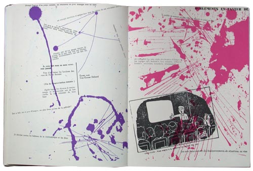
Mémoires covers the years when Debord and friends decided to leave the Letterist Movement, and founded the Letterist International which ultimately ended up merging with Jorn’s Bauhaus Imaginiste and the legendary Psychogeographical Society of London to form what should be the Situationist International. Debord’s book also covers the release of his first and foremost important movie,  Howling in favour of Sade Howling in favour of Sade . A movie with no images. It consisted of a black and white flickering projection of nothing. The white parts had a voice over, the black parts were left in silence. The reaction to this anti-cinema was disgrace. People felt ridiculed for watching nothing. It was Debord’s intension to boil cinema down to nothing, proving its eminent death. The showing of the film is covered over a double spread in Mémoires. The left hand page is decorated sparsely in purple with the right hand side in bright pink. The colours do not float on the page, they scream at you, as if etched agressively into the print plate with a knife. . A movie with no images. It consisted of a black and white flickering projection of nothing. The white parts had a voice over, the black parts were left in silence. The reaction to this anti-cinema was disgrace. People felt ridiculed for watching nothing. It was Debord’s intension to boil cinema down to nothing, proving its eminent death. The showing of the film is covered over a double spread in Mémoires. The left hand page is decorated sparsely in purple with the right hand side in bright pink. The colours do not float on the page, they scream at you, as if etched agressively into the print plate with a knife.
The double page spread from Mémoires, a comment on the feedback Guy Debord received upon releasing this film. Unfortunately a reproduction from the facsimile version.
|
The right hand page contains various reactions on the film: «un exemple manifeste et unique dans tous les siécles de ces extrémites furieux» (An obvious and unique example in all the centuries of these furious extremes). Another one reads «D’autre ont dit et diront encore la beauté de ce que l’on voit sur l’écran l’usage révolutionnaire qui est fait du cinéma» (Other have said and will say again, the beauty of what we see on the screen, the revolutionary use, that is done of cinema). The film did not contain any visual elements that can be linked to the notion of détournement or psychogeography. Rather its force lies on the audio side, with various voices interconnecting, quoting from different conversations, books etc.. Read aloud by a mixture of LI members. It plays on oral juxtapositions. The pages in Mémoires is yet again a ridiculing those who were brave enough to watch it, but it also quotes those who praised it.
Apart from the cover being very different from Fin de Copenhague, this book is much more structured product. Divided into sections and entirely in French. Jorn’s book was multi-lingual, with text appearing in Danish, English, German and French — perhaps indicating Jorn’s international youth. Mémoires is, however, also a psychogeographic map, and this time it is of France. It consists of three chapters dating around the time when Debord first arrived in Paris. Lars Morell writes, «in one way Mémoires was also a provocation, because naturally it was unusual, that Debord born in 1931, was to publish his auto-biography, at age of 28»[26]. The book tells the tale of the short life of the Letterist International, Debord’s pre-situ group, before founding the Situationist International in 1957.
The book is most famous for its sandpaper cover. An auto-destruction feature that enabled it to damage not only the book it might be standing next to in the bookshelf, but also the person who would be reading it. An anti-book to destroy all other books. Permild writes:
Long had he [Jorn] asked me, if I couldn’t find a unconventional material for the book cover. Preferably some sticky asphalt or perhaps glass wool. Kiddingly, he wanted, that by looking at people, you should be able to tell whether or not they had had the book in their hands. He acquiesced by my [Permild’s] final suggestion: sandpaper (flint) nr. 2: ‘Fine. Can you imagine the result when the book lies on a blank polished mahogny table, or when its inserted or taken out of the bookshelf. It plans shavings of the neightbours desert goat’.
In all the literature that I have located, Debord is the person who is refered to as the inventor of the sandpaper cover. However, as it turns out Debord had nothing to do with it, thus destroying the picture of him as the mastermind behind Mémoires. A picture of him which is emphasised in the facsimile edition, that I will cover later. Permild continues, «Asger loved — as he often expressed it — to place small time controlled bombs». This was certainly a bomb. A bomb invented by the printer, who’s job is normally of a technical nature. The sandpaper cover was a really good idea, but practically it never managed to practice what it preached. It did, however, make its readers conscious about handling it or where to place it.
One the other hand, Mémoires placed itself on a shelf among precious object, something to be handled with great care. Standing as the opposite of the content which was made entirely from pre-fabricated elements, but once surrounded by a coating like sandpaper, frames these icons of the spectacle into something destructive. The American Hakim Bey did something similar in the 1970s. In homage to Guy Debord, Bey made a book with sandpaper on the inside. This way he rendered the book into auto-destruct mode if you would ever dare to read it. A potential bomb to go of if you would open it. Mémoires, on other hand is a bomb, not a potential bomb. No matter how you would handle it, there was always the danger that it could damage your precious collection of 1920s French poetry.
As much as Fin de Copenhague was a spacious book containing maps of various sorts and the free floating of colour, Mémoires is a book rigorously structured according to time. Or as Greil Marcus writes, in his piece entitled, A Situationist Primer : «. . . the book has its own voice: the voice of romatic, heroic, questing, dissipated, reflective, melodramatic, even schoolbuy adventure. No matter how empty the world may seem, the voice says, no matter how degraded and used up the world appears to be, anything is possible. It is this distinctice voice that speaks across the two books. One that satires their country of origin and the «Old World of unique artisitic individuality. They are both quite different, yet alike, in that they are based on the same principles, psychogeography and détournement. To be détourned was to be hit by SI’s strongest weapon against the spectacle. Just as Hussey titled his biography of Debord, The Game of War. The Situationists’ were the gun, détournement the bullet and the spectacle its enemy, but did they ever pull the trigger?
To understand the differences between Guy Debord and Asger Jorn and their two books, it is important to look at their origins. Howard Slater quotes from a later Scandinavian Declaration[27]: «We do not always distinguish between theory and practice. We intend to produce our theories after the event. . . The French work exactly the other way around. They want everything straight before they start and everybody had to line up correctly» . This outlines the crucial difference between the two books and how they were made. Fin de Copenhague was made before the SI was founded. The concepts that bind the book together were at that point (early 1957) only part of an experimental playground to try out their new ideas. Mémoires on the other hand, was made in an entirely different manner. It is a sinister book, the title, the jacket that coats it, the quotes from Huizinga and Marx etc. Together they emanates a total rejection of established standards, the utmost negation. Gone is the spontaneous and seemingly random playfulness of Jorn’s book. Every page in Debord’s has been carefully designed, even though it is attempting to appear anti-typographical. Howard Slater continues: «Jorn’s project, with its use of a ‘comparative’ method of art history that gave greater weight to the uncaptioned juxtapositions of images from different places and times, was weighted in favour of visual essays rather than a use of images that illustrated theoretical texts». Slater touches upon the core difference between the two. As if you could set a schematic comparison. Jorn would fit into the Dionysian sphere and Debord the Apollonian. Though it is unclear whether such a categorization would fully explain anything, except place each of them in a box. It is the contrast between reading (structure) and looking (stream) that coins the understanding and making of the two books. Mémoires is an illustration of the theory, merely a direct practical result of the appropriation of theory, dry — and without the wit and energy that Fin de Copenhague has. Jorn’s book is an experiment from which the theory were extracted. Debord made the content of Mémoires in solitude. He started work on his book after completing Jorn’s, and it took him two years to finalize it. The madness that often lies behind every page in Fin de Copenhague is gone in Debord’s.
Facsimile: Mémoires
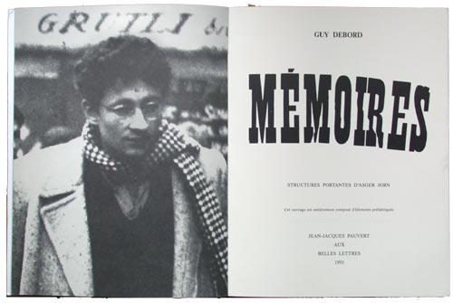
Mémoires's facsimile title page with the cropped portrait of Debord
During my research I had the opportunity to compare the original version, printed by Permild & Rosengreen in Copenhagen, May 1959, and the facsimile edition from 1993 by Jean-Jacques Pauvert. The two versions are completely different, and should be looked upon as two individual books, and not as a original and its facsimile version. Comparing the two versions, nevertheless, speaks directly about the reproduction of SI works prior to the suicide of Guy Debord. Everyone, with the possible exception of those who are obsessively interested in the phenomenon of first editions, will probably never encounter the original book wearing its auto-destructive jacket. This facsimile is only a vague links to the famous artifact that it is based on. An artifact which is being artificially kept alive. Maybe, just maybe – this is the ultimate self-destruction, one that not even the cover could manage. Perhaps the facsimile is the real victory over the spectacle, by removing the original cover, degrading the colours — positioning it more easily on a shelf which offers greater comfort in accessibility.

Mémoires' original title page
The first and foremost striking difference is the lack of the sandpaper cover. The facsimile is almost twice as thick as the original, but with the same amount of pages if you exclude the addition of the foreword. The 1959 edition was printed on a very thin paper[28], that appears semi–transparent.
On many pages you can see the underlying page shine through. This sense of multi layering is gone in the reprint. The facsimile edition is printed on a thick matt white paper, and thus lacks the fragileness of the original. Inside the first few pages there is a black & white portrait of Guy Debord. A famous picture of him, cropped, walking down a street in Paris. In the 1959 version there is no picture of Debord – instead there is a black page. Including this edge to edge portrait of Debord, they seem to be honouring Debord, ignoring the fact that Mémoires was a collaborative project between Asger Jorn, Guy Debord and the Danish Printer, Permild & Rosengreen[29]. It could be that the reprint works as a celebration of Debord as a creative genius. Nonetheless you can live with these differences. The important difference are in the content of the book.
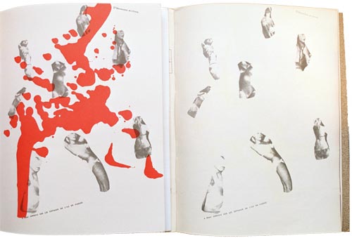
comparison of the two versions. On your left the reprint on your right the original
No page has been reproduced rightfully. All the colours are off. A vibrant blue is turned into a dull heavy clumb, some more than others. Jorn’s mono–colour splashes on the pages have been reduced to a flat and dull layer between — and sometimes over the text. In the original you could occasionally see the different mono types of colours mixed together in a gradient transition, connecting one page to another. These transitions are completely gone in the reprint. It does not have the tightness and intensity that the original from 1959 still has. Another subtle but important difference between the two editions, are the chapter sections. As I have talked about before, Mémoires is divided into three chapters. These chapter pages are all typed with a sans-serif font in the original, but in the reprint they appear typed in a sans type font, again breaking away from the original layout[30]. Two pages in the original version of Mémoires have a very vague tone of green on them (p. 54-55). In the reprint p. 54–55 have had splashes of red ink added to them. The double spread contains various cutouts of female lingerie floating around on the page. The last page, p. 58, has a very light tone of blue on it in the original version. In the reprint this is gone and replaced with another splash of red ink. Why these additions were made, and why the printer of the facsimile could not recreate the gradient of colour is not only a disgrace to the original, but also indicates that something must be happening here. What is really intriguing is whether or not Guy Debord[31] authorized these differences to be made, or whether he had other and more important things on his mind?
3. Conclusion
The artistic phase of the Situationist International pretty much ended in the early 60s. Many, if not all of the people who were active during that period either left or were thrown out for not following the strict set of rules that Debord had set up. For a lot of them this was a brutal attack in the back, since they had dedicated a whole lot of their lives to the mission. For Debord it was his way of keeping the group as tight knit as possible. What remains of the vast amount of material that they produced is now stored away in archives across Europe and has been reprinted in various degraded versions.
The facsimile edition, for instance, of Mémoires is a populist product, a boiled down presentation to fit easier into our increasingly alienating culture. It has placed itself as far away from the original as possible. The book is no longer a lived experience, but has been adopted by the spectacle for the spectacle. It is a fine art book, joining a tradition with its thick white paper and bright colours. It goes against everything the SI stood for. The inclusion of Debord’s portrait, directly praising him as an unique artistic individual. The book is now important because Debord was involved, and not for what it actual says on its pages. It is frightening in many ways, since the original is so rare, enabling the facsimile edition to be what you would normally encounter. The facsimile is what you will experience. It is crucial for a proper reproduction that it follows its original as closely as possible. All details are of extreme importance! Whether they have used a different style for quotations or have changed the colours. You do not add anything to a reprint, nor do you take anything away, unless the addition lies in form as an appendix and or a foreword.
Another example of recent Situationist misappropriation appeared in an issue of Adbuster, an «anti-capitalist» American magazine[32]. A photograph of Mémoires appears in a bookshelf next to some other books, illustrating its destructive cover. The picture text explains that this is Debord’s book, but it is not. The book shown is too thick to have anything to do with the original[33]. It was simply as an illustration of different graphic design. There is, however, something almost poetic about the title page of the facsimile version. Something which has a scent of resolution. If you look closely at Debord’s cropped portrait, it seems as if his eyes are looking at the right hand page. Starring at the sentence «This book has been made entirely form prefabricated elements» – or more likely on the name of Asger Jorn, who was the person in charge of arranging the foundation of the SI. Without Jorn I am not sure it would have happened, or at least not in the way it did. His enthusiastically and spontaneous approach to most things probably helped them along the way.
He did not want the spectacle to swallow the history of the SI and transform them into yet another French intellectual movement, that had ultimately failed. Because of this he became increasingly concerned that the Situationist International were to leave behind them a legacy of historical inaccuracy. A Mémoires had to be left behind, which told the real story of what had happened in the years of the movement. At this point Debord’s many books had reached a level of academic reading and scrutiny which rendered him in the eyes of the public, into what he hated the most, a celebrity. Debord were in these years changing from one publishing house to another, battling over legal matters in court. It was during this period that the publishing of Mémoires facsimile happened. The book came out eleven months prior to Debord’s suicide that once and for all left the Situationists and their legacy in the history books.
One can argue that the SI in its late days, especially Debord who seem embody himself with the very notion of what it meant to be a Situationist, that they had grown to be so recognized and established as a movement, that they became their own art critics — an institution they were originally opposed to. In the latter days of Debord’s life, especially after Jorn’s death in 1973, he had withdrawn himself from almost all social activity to a pathetic life of solitude. He was convinced that since the near revolution of 1968 had failed, he might as well dedicate himself solely to the act of self-destruction. Again this marks one of the key differences between Jorn and Debord. Jorn had never shown any self-destructive tendencies and had remained active until the very end, continuing his mad tempo of activity which originally had brought humour, spontaneity and playfulness into the SI.
The SI might be most famous for their involvement in the 1968 student uprising in Paris — but what remains increasingly fascinating for a generation of people who were born a decade later, is an interest in their artistic phase. A phase when they materialized their many ideas and concepts into a new visual language, a language that took no prisoners. One that ultimately wanted to destroy the spectacle. The books were sophisticated declarations of war, a war that was fought in the streets of Paris in 1968. It was a period were no short-cuts were taken, it was brutal and unforgiving. They had the guts to continuously hit the nail on its head over and over again.
(February 2002)
Bibliography
[1] Atkins, G. Asger Jorn, the crucial years 1954-1961, vol. Two of three. Lund Humpries, London, 1977. Colour plates by Permild & Rosengreen, Designed by Herbert Spencer. Made in cooperation with Troels Andersen.
[2] Ball, E. The beautiful language of my century: The situationist politics of détournement are apllied in recent american art. Arts Magazine 63.5 (1989), 65–72.
[4] Buffet, B. Bernard Buffet. Metthuen & CO Ltd., 1964.
[5] Debord, G. Society of the Spectacle. Zone books, 1994.
[6]Debord, G. Détournement as negation and prelude. Internationale Situationniste 3 (December 1959). Translated by Ken Knabb.
[7] Debord, G.- E. Mémoires, first ed. Permild & Rosengreen, 1959. Structures Portantes D’Asger Jorn.
[8] Debord, G.- E. Mémoires, second ed. Jean-Jacques Pauvert aux Belles Lettres, 1993. Structures Portantes D’Asger Jorn.
[9] Debrix, F. Specters of postmodernism: Derrida’s marx, the new international and the return of situationism. Philosophy & Social Criticism 25.1 (1999), 1–21.
[10] Ford, S. The Realization and Suppression of the Situationist International. AK Press, 1995. An Annotated Bibliography 1972-1992.
[11] Gray, J. Eclipse of the Spectacle. NY, New Museum of Contemporary Art, 1989, pp. 283–294.
[12] Hussey, A. The Game of War - The Life and Death of Guy Debord. John Cape London, 2001.
[13] Jorn, A. Fin de Copenhague, first ed. Bauhus Imaginiste, 1957.
[14] Jorn, A. Guy Debord and the Problem of the Accursed (1964). Preface to Debord’s Contre Le Cinéma, Translated by Roxanne Lapidus, from http://www2.cddc.vt.edu/situationist/postsi/accursed.html.
[15] Jorn, A. Fin de Copenhague, second ed. Editions Allia, 1986. Guy Debord adviser in Psychogeography.
[16] Maayan, M. D. From aesthetic to political vanguard: The situationist international, 1957-1968. Arts Magazine 63.5 (1989), 49–53.
[17] Maragliano, G. The invisible insurrection. Flash Art , 87–90.
[18] Marcus, G. Guy debord’s m´emoires, a situationist primer.
[19] McDonald, P. Guy debord, comments on the society of the spectacle. Screen 32.4 (1991), 491–494.
[20] Morell, L. Da jorn var færdig med københavn. Standart litteratur magazine Nr. 3 (1995).
[21] Nieuwenhuis, C. New urbanism. Provo 8 (1966). English translation published by The Friends of Malatesta.
[22] Permild, V. Erindringer on Asger Jorn. Galerie Moderne, 1982. With help from Aksel Evin Olesen.
[23] Pinder, D. Old paris is no more: Geographies of spectacle and anti-spectacle. Antipode 32.4 (2000), 357–386.
[24] Shevlin, E. F. To reconcile book and title, and make ’em kin to one another: The evolution of the title’s contractual function. Book History. 2.1 (1999), 42–77.
[25] Slater, H. Divided we stand. Break / Flow (2001).
[26] Stang, R. I., Ed. The Book of the SubGenius. Simon & Schuster, 1987.
[27] Sussman, E. The Passage of a few people through a rather brief period of time: The Situationist International 1957-1972. The MIT Press, 1900.
[28] Wollen, P. Situationist architecture. New Left Review 8 (2001), 123–139.
[29]Wolman, G. D. . G. J. A user’s guide to détournement. Les L´ævres Nues 8 (May 1956). Translated by Ken Knabb.
Notes:
[1] Guy Atkins, p.63.
[2] The magazine, International Situationniste was published from 1957 to 1972, 12 issues.
[4] Afterword to Fin de Copenhague facsimile.
[5] The Situationist City, p. 20.
[6] Michelle Bernstein, from Potlatch 911, 1731 August 1954.
[9] The Architectural Review, in Fin de Copenhague facsimile
[10] I have been unable to track down any copies of the original books , but on bookfinder.com the complete collection of the original International Situationniste magazine is for sale at a price of $30.000
[11] Society of the Spectacle, Thesis 6.
[13] Arts Magazine, p. 49.
[15] Society of the Spectacle and other films, p. 14.
[16] Internatinal Situationniste, issue one, translated by Ralph Rumney, Hussey p. 126.
[17] Lars Mortell, Standart.
[18] Bernard Buffet, Metchuen 1964
[19] The Architectural Review, Volume 122, numéro 729, octobre 1957.
[20] Art in America, October 1989, P. 111.
[23] My research is based on number 53 out of 200, signed by Debord and Jorn in pencil.
[24] Permild writes, «. . . it had to be iris printed, which means, that the colours would softly blend together» .
[26] Lars Morrell, Standart.
[27] Howard Slater, Divided We Stand. An outline of Scandinavian Situationism.
[29] The full frame picture is included in Andrew Hussey’s biography of Debord and features to his right Pierre Feuillette. The photograph in Mémoires reprint is an extreme close up on Debord face, leaving the rest in the shreder.
[30] The original uses the french style quotation marks, «» and the facsimile the english style “”.
[31] Debord is credited in the original version as GuyErnest Debord and Guy Debord in the reprint.
[32] Missing reference to the specific issue.
[33] Adbuster, the magazine behind the ‘Buy Nothing Day’ issue ? - missing.
*Christian Nolle hails from Denmark but is currently working in London as a photographer and graphic designer. More info at http://www.cnolle.com
|